The Long View

Knowledge Navigator
Some companies make concept videos the way Detroit makes concept cars. The point is to give customers the impression that the company has an exciting vision of the technology future. Apple is not that kind of company any more. Concept films these days come from Microsoft and from Google, companies that need to stake some claim on a technology vision of the future that is increasingly dominated by Apple. But there was a time when Apple made concept videos.
In 1987, Apple was recovering from the initial disappointment about Macintosh sales. The Macintosh Plus and SE had fixed the shortcomings of the original Macintosh. The new Macintosh II line offered a more powerful and expandable family of workstations for demanding applications. Most importantly, desktop publishing was taking off, powered by the combination of the Apple LaserWriter and Aldus Pagemaker. Although the Macintosh still claimed only a small part of the market, it had succeeded among the most important trendsetters: creative people, writers, artists, and especially academics. Because of this, you might have thought that Apple's famous concept video Knowledge Navigator was a way of celebrating their strength and confidence in their vision of the future. But according Bud Colligan (one of the creators of the film), it was actually inspired by fear, not joy. Steve Job's new company NeXT was building a computer intended specifically for the higher education market. Everyone knew that the NeXT machine would be better and more sophisticated than the Macintosh. It was the machine that Apple should have been making themselves, and everybody was talking about it. It was scheduled to appear in the next few months. The leadership of Apple was rightly afraid that NeXT might overtake them in the higher education market, whose users were hungry for more advanced computing equipment. Although higher education was a small market, the Macintosh was very strong there, and it represented an important component of mind-share they did not want to give up to NeXT. Concept videos are about mind-share, not market-share. Remember, even during those good days at Apple most of the computer market consisted of business people repetitively using their IBM clones to run a single program, usually a spreadsheet. That was making a lot of money for Intel, IBM, Microsoft, and the clone makers, but nobody (aside from pundits writing for PC magazines) could seriously think that was the future of personal computing.
The Film
Apple made the Knowledge Navigator video to illustrate their vision of the future of computing, and John Sculley showed it at a keynote address he presented at Educom, a trade show for academic computing. It was a marketing thing, and of course it was made by marketing types. According to Hugh Dubberly (then of Apple Creative Services), the film was made by him for Apple, working with Bud Colligan, the head of higher-education marketing at Apple. But they had technical help from Mike Liebhold, who was also working for Apple at the time. Liebhold was a Senior Scientist at Apple's Advanced Technology Labs, and an advisor to John Sculley on the future of computing, media, and the internet. He was then and is now especially interested in location-based computing and the mobile web, and he is currently a Distinguished Fellow at the Institute for the Future. Alan Kay, who was an Apple Fellow at the time, was also involved. Alan Kay had several years before advocated the development of what he called the Dynabook, a small computer that would have continuous access to libraries of knowledge via some sort of ubiquitous network. The film focuses on the kind of device Alan Kay had envisioned, and its use for education, which was also the main application Kay had in mind for it. Of course a device like this would have other applications, but the movie was intended for an audience of educators.
To today's eyes, the film seems amateurish, even a little silly. Its opening is a blatant rip-off of a popular PBS television show of the time, Masterpiece Theater, with Alstaire Cooke.  Masterpiece Theater started with a close-up flyby of a bunch of books and objects from famous stories, accompanied by some dramatic classical music. Like the television show, the Apple film starts with a series of close-ups of fancy looking objects on a desk, accompanied by a somewhat similar-sounding musical piece. The stuff on the desk includes some photos in elaborate frames, a cup, various desktop knick-knacks and a Crookes radiometer. The vanes of the radiometer are spinning vigorously, despite what turns out to be very warm and subdued lighting in the Professor's office containing the desk. The office is huge, and looks like Thomas Edison's office in his West Orange NJ laboratory. It has a mezzanine. No college professor has ever had an office like this, but this is the future. Maybe that was intended to be a prediction. Remember this is designed for a higher-education audience. That means it is designed to seem smart in a slightly over-the-top way. This was probably just good marketing, designed to appeal to the belief shared by most college professors that they are a kind of modern aristocracy, a refined class who appreciate the finer things that are lost on the common man. They are the type that would watch Masterpiece Theater. They should have offices like that.
 Maybe someday they will.
Finally, the camera stops on a futuristic device that looks like a book from a Flash Gordon film. It’s got a weird metal triangular thing sticking out of the binding. Nearby sit three shiny futuristic-looking metallic cards. Everything else on the desk looks old, like the stuff from the Masterpiece Theater introduction. A college professor walks into the room and opens the book, pushing a button that is exposed on its left margin, and.. Bong... you hear the familiar startup sound. The book-like thing is a Macintosh.
The Thing Itself
The bong sound is the 1987 version, a slightly warmer version of the the bong you would get from an SE or Macintosh II. The triangular metal part attached to the outside of the binding is apparently just decoration. When unfolded, the book reveals two flat panels, some Snow White Design ornamental grooves and ridges, and a camera pointed at the user.

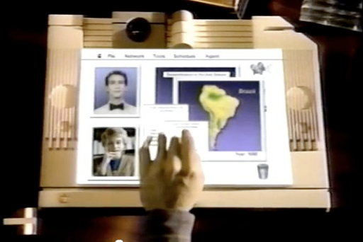
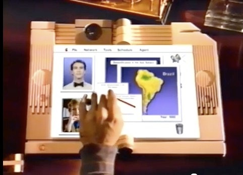
Is it fair to look closely at this imaginary tablet computer and try to interpret what it looks like and what it does? I think so. Of course it was a simulation, a prop, not a prototype. But the project had the technical advice of two serious Apple-employed computer futurists who took this kind of thing seriously. The film was also widely used at Apple as an inspiration for the kinds of technology that should be incorporated into future designs. It wasn't just a prediction of the future, it was used to inspire future designs. On the other hand, the familiar bong at startup was put there to remind us this not just some future computer, but a future Macintosh. Some of its other features may be there only to carry the Macintosh brand. Like the menu bar at the top of the screen, for example. What is that menu bar for? At no time during the video does the user do anything even vaguely like a menu selection. The menus are titled File, Network, Tools, Schedule, and Agent, respectively. There is even an Apple menu. The menu bar goes a long way toward making the thing look like a Macintosh screen, although the user doesn't use it the way it would be used on a 1987 (or a 2012) Macintosh.
A File System
The Knowledge Navigator is connected to an imaginary network that has all the information you would ever need, but it also has a local file system. It has an image of a book, rather than a disk, on the desktop where a disk icon ought to be. Also notice the trash can. What else are you going to put in the trash? Finally, there are those shiny cards. The professor copies some data from his computer onto one of those shiny cards. It’s not exactly clear why he does this, but I’m guessing he needs the data for his lecture. Although his Knowledge Navigator has everything he needs on it already, and has immediate network access to all knowledge everywhere, he still needs some removable storage he can take with him. Like most college professors, he probably still has to give his lecture using some lowest-bidder Windows machine that his University's IT guys have installed in the lecture hall.
The professor commands the data copy to the removable device by a voice command. But later, to combine two data sets, he brings up a window by tapping on the screen and drags some things into that window. It goes pretty fast, but I think he must have something like the Finder running on the desktop, and he had to navigate his file system to put his data in the right place. But there was no Navigation Services (Standard File) dialog. It looked like he was able to drag data from an editor window into the file system the same way we can drag a file out of the file system and drop it into an editor window or application icon. This is impressive, especially given that the film was made before drag and drop was introduced to the Macintosh Finder in 1991. The System 7 Finder gave us the ability to drag a file into an application, but it never gave us the ability to drag the contents of an application into a folder and have it saved as a file there. Instead we have had to use Save As..., open a Navigation Services dialog, work our way through the tree structure of our file system to select a location, and then click Save.
This way of saving data in a file hasn't become easier or smarter since it was introduced in the original 1984 Macintosh. Instead of the very cool solution shown in Knowledge Navigator, Apple's current solution is simply to reduce our options about where we save things. Apple seems to think that if I would only agree to keep all my photos in my iPhoto library, there would be no problem figuring out where to put them or where they were saved. I would never need Save As..., and of course, Save As... is being eliminated. But in that case, I should also forget about writing my file to those metallic looking cards. The professor in that Knowledge Navigator movie would have to just hope those generic PC's in the lecture hall could get access to iCloud in time for his lecture.
Speaking of icons on the desktop, what is that movie projector doing there just above the book at the upper right? No idea what it is doing there. Movie projectors like that have not been in common use (outside commercial theaters) for a long time. They were already being replaced in everyday life by video tape in 1987, but I guess they were still recognizable symbols for playing movies. Between now and then, we have almost forgotten what they looked like.
Multi-touch
Knowledge Navigator had a touch screen, but it did not have multi-touch. The professor uses his finger like a mouse, and when he drags something from one place to another a broad red line is drawn to indicate the track that his finger took on the screen. Actually, it isn’t at all clear how the touch features on this thing work. The professor touches the screen and stuff just happens. What kind of touch did he do to bring up a window for him to select something in, versus the touch that made a window go away? The windows don’t have much in the way of buttons or other controls on them. We don’t see any popup menus. Some things just go unexplained. But if it did have multi-touch, it would be easier to see how the screen could be used that way.
The Agent
The most striking thing about the film is the conversational interaction between the user and the computer. There is something profound about its use of speech as a user interface. Speech-controlled software is one thing, but this is more than that. In the years since the film was made, all of us have used some kind of speech-controlled computer system. Apple introduced speech as a way of controlling Macintosh software with PlainTalk in 1993. At first is was only available on Quadra models equipped with digital signal processors, but it worked on all the later PowerPC models, and continues to be available on all Macs today. The Apple system leverages AppleScript support. Because AppleScript is supported to some extent by nearly all Macintosh software, the connection between AppleScript and speech control of the computer provides speech control with no special effort on the part of programmers. There is no speech API. Anything that could be scripted by AppleScript can be done by speech. By default this is all turned off in OS X, but if you go to the Speech preference panel and turn Speakable Items on, and also turn Speakable Commands on, you will find you have the same speech recognition system that Macintosh had since System 7.1. The user interface is almost unchanged, but I think it works a lot better now than it did then. I remember that when I tried it back in System 7, it couldn’t understand half of what I said. Now, it seems to work perfectly nearly every time. And because speakable items are basically just AppleScript scripts, it is easy to create a complete set of speech commands for any command set of nearly any program. I notice the Windows 7 has a very similar system, although without AppleScript (or anything like it), Microsoft had to create a speech API, and only the programs that support that API will respond to spoken commands. Of course, Microsoft has famously created spoken control of the passenger compartment electronics in Ford automobiles, and this seems to work pretty well.
According to some, Apple secretly agreed to quit working on speech recognition on the Macintosh for a while as a part of the 1997 deal with Microsoft. Supposedly, Microsoft wanted time to develop speech recognition without any competition from Apple. I don’t know if that is true, but if so, it probably wasn’t a hard thing for Apple to agree to. Nobody was using the existing speech command system anyway. They still don’t. And Apple was doing too many things at the time and needed to focus.
But speech-commands are not the same thing as the speaking agent in Knowledge Navigator. Yes, it does respond to commands like “let me see the lecture notes from last semester”. But when the professor is trying to find the name of an author, and says it wrong, the agent corrects him. This is substantially more sophisticated than speech commands. The agent doesn’t just serve information to the professor on request, but he uses it himself to answer questions he wasn’t asked. This is the aspect of the agent that we glimpse in Siri. Of couse Siri is very limited, and certainly can’t correct your mistakes. But it is a step in that direction. On the other hand, Siri is so far not very useful for controlling the computer (or phone). At this point, iOS has nothing like AppleScript, or even like Window’s Speech API. Siri knows how to do certain things in certain programs. All of these programs are provided by Apple. This means there is an API, but it is not yet public. Neither Siri in iOS nor Speakable Items in OS X can match the capabilities of the Knowledge Navigator agent.
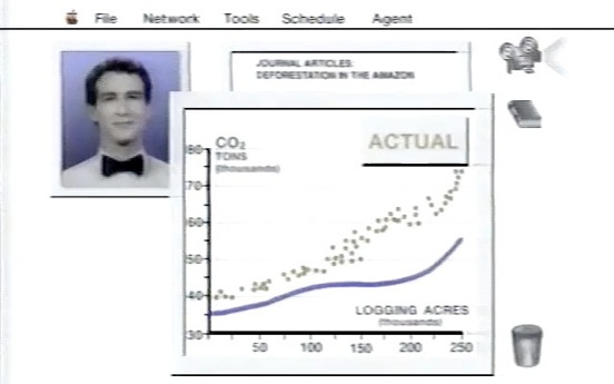
One aspect of the agent that is often mentioned is his appearance. In Knowledge Navigator, he is depicted as a real person, in a window exactly like the kind used for video chat with a real person. Apparently Apple wanted to make the computer agent seem a lot like a person. This seems unnecessary, and even asking for trouble, from a user interface perspective. What should the agent look like? Should it be male or female? Should it have some ethnicity or nationality? In Apple’s global market, there is no way to avoid these questions. In a real market, the agent shown in the Knowledge Navigator movie would need to be user-configurable. The user would want to set the language it speaks, of course, but also to control its gender, style of dress and the color of its skin. And for what? Why do we need to see the agent? Is he doing some body language or something that we don’t want to miss? If Knowledge Navigator had ever come about, the agent would not appear on screen, but would only be a voice. And it would have avoided revealing its gender or nationality. Maybe it would claim not to have been assigned a gender.
The User Experience
One prominent thing about Knowledge Navigator is the way it uses the screen. Everything happens on the same screen, with overlapping windows. There are apparently no programs, just data and things you can do with data. It is as if there is only one program. The agent, the professor's schedule, the video chat with his colleague, the graphs and maps, all happen in windows that are all present on the screen at the same time with no reference to any programs. The professor asks the agent to show him data, without saying anything about what program to use. The menus in the menu bar never change. Everything is apparently happening in a single program. Imagine trying use an iPad, with or without Siri, to do these things. The professor would not be able to look at data while doing a facetime chat with his colleague. He’d have to interrupt the chat just to look at the graphs or to ask Siri to do something. To follow his instructions, Siri would have to invoke a new app, and the stuff the user was looking at when he asked for help would disappear. If the professor asked to see the movie showing the growth of the desert, he’d have to leave whatever program he used to look at the still images and graphs. The Knowledge Navigator is definitely not the iPad. The iPad is a simplified consumer device for people who want to work with one kind of information and do one thing at a time. iPad users are acutely aware of the various programs they have installed, and what each one does. Knowledge Navigator was intended to be the opposite kind of device. It was envisioned as a flexible tool for knowledge workers, who would concentrate on their data, not on the programs that operate on it. The Lisa Office System was the first version of this kind of system. The Macintosh didn’t have the horsepower to provide a system like that at first, but continuously evolved in that direction during the 1980’s. About 6 years after the Knowledge Navigator movie was made, Apple introduced a software system like it, called OpenDoc. It was a single program that would invoke almost invisible, unnamed programs to perform functions in individual windows. The user didn’t pay any attention to the programs, but was focused on the information. All programs rendered their data in windows that shared a single screen. The OpenDoc product was abandoned by Apple soon after the return of Steve Jobs, along with some other projects that were seen as a distraction. Gradually, Apple has moved farther and farther away from that vision, and closer to the simple single job concept of the original Macintosh.
On the way to Knowledge Navigator, Apple made a left turn and decided to make something else. Maybe they discovered that achieving the economy of scale required to make it affordable required a larger market. Instead of a powerful tool for information professionals, they had to make a single job consumer device for playing games and watching movies. Instead of a tool for changing the world, they made one for passing the time. They used a lot of the same technology, but repurposed for play, rather than work. After all, there are precious few people who want a tool like that for work. The Knowledge Navigator is even wasted on the professor in the movie. He’s a slacker. He comes to work about 10 minutes before lunch time. The computer tells him that his research team in Guatemala (who are presumably doing all the real work) has checked in, but he doesn’t care about that at all. His schedule for the day consists of lunch, taking Kathy to the airport, and giving a single one-hour lecture. And he gets his colleague to do part of his lecture. With a leisurely schedule like that, he really doesn’t need such a powerful computer. He would do fine with an iPhone with its Calendar and Siri to make it appointments. He might not even need that. He’s so anxious to go to lunch, he won’t take a telephone call from his mother. His own mother.
Friday, May 11, 2012