The Long View

Scroll Bar
Text and images have never fit on the screen of your computer. This is even more true recently, Computer screens, which grew larger in the 1980’s and 1990’s, have recently shrunk back to 1980’s scale. There is an app for Android and for the (jailbroken) iPhone that emulates the Macintosh Plus, including its tiny 512x384 pixel screen. The original 1984 Macintosh screen won’t fit on the screen of most phones. It has to be scrolled.
In the beginning we scrolled text
For users of the Apple II, and CPM and MS-DOS based personal computers (and also VMS and the original versions Unix), scrolling meant text. Images, if you could make them at all, were small, and pretty much had to fit on screen. The ancient and unquestioned method of scrolling text was with a cursor, that marked the current insertion point. Scrolling kept some portion of the text surrounding the current insertion point on the screen.
Line editors were common in the early days, and were still heavily used in the beginning of the MS-DOS period. The single line, terminated by a line-end character (return, linefeed, or the combination) was a natural unit of text. A line of text was 80 columns for fewer. Why 80 columns? Because that is the amount of text that could be stored on one of those IBM punched cards that were used for writing programs back in the 1960’s. Usually, only the first 72 columns on those cards were available for use. A line of text (usually code or numbers) had to fit on an IBM card, and the keypunch machines that punched holes in those cards worked like a typewriter. That is, they punched holes corresponding to the key you hit, just as you hit it. If you made a mistake anywhere on the line, the card was ruined. You ejected it, threw it away, and punched that card over. Trash cans next to keypunch machines were always full. In the 1970’s, IBM introduced the model 129 keypunch, which had a one-line buffer. On the 129, you could type an entire line, make sure it was right, and then punch it all at once. When interactive computing using electronic terminals came into use (also in the 1970’s), a line of text remained 80 columns (characters), and you moved the insertion point around on the line initially using escape sequences, the backspace key, and later using cursor keys. Most terminals could display exactly 80 characters per line. This, by the way, was completely compatible with printed text, as it was handled at the time. A line of text typed on a typewriter was a maximum of 80 characters, being 6-8 inches wide and typed at 12 characters per inch (elite) or 10 characters per inch (pica).
With the availability of electronic terminals that could display 25 lines of text, it was natural to allow the user to see more than one line of text at a time, and move the cursor vertically from line to line, as well as horizontally. When the insertion point moved to the edge of the on-screen block of text, it was necessary to shift all the text up or down, to keep the insertion point on screen. Because the first terminals didn’t have cursor keys, visual editors had to come up with a way to move the insertion point using the existing key set. There were two general solutions to the problem, both of which relied on the existence of non-printing keys, especially escape and control. One, exemplified by Bill Joy’s vi editor, was to create two modes, insert and command. In insert mode, keys typed were interpreted in the usual way, with characters being inserted at the insertion point. In command mode, entered by punching the escape key once, characters were interpreted as commands rather than letters of the alphabet. In command mode, typing j would move the cursor down one line, k moved it up, h moved it left one character, and l moved it right. Typing 0 moved the insertion cursor to the first character in the current line, and $ moved it to the end of the line. Do these make sense to you? Other commands, for example to move forward or back by a full screen (25 lines) could be generated using the control key. To execute a control sequence, you had to hold the control key down while typing another key. To get back into insert mode from command code, you typed i (this one, at least, I understand). The second strategy, exemplified by Richard Stallman’s EMACS, was less modal, relying more heavily on control sequences. In EMACS, control-n took you to the next line, control-p the previous line; control-f moved the insertion cursor forward one character, and control-b went backwards. If the control key was not held down, typing keys inserted characters. Early word processors, like WordStar for CPM and MS-DOS, used a similar complex set of commands, in the days before the Lisa and Macintosh.
Smalltalk-80 changes everything
In this, as in many things, Smalltalk-80 introduced a new set of ideas. The mouse was used to set the insertion point. Scrolling was dissociated from the insertion point; it was possible to scroll the insertion point out of the field of view. The concept of a text line was weakened, because text wrapped in a window, and the number of characters displayed in a line changed when the window was resized. The unit of text remained a string of characters terminated by a newline character, but there was no requirement that it be 80 characters or less. And now that unit of text represented a paragraph, not a line. A line of text became arbitrary, subject to the user’s choice of window size. Moving the cursor up and down by a line had no meaning in Smalltalk-80, and there was no keystroke that could do it. The insertion point had to be controlled using the mouse. But text still took up more space than could be shown in a window. The solution to this was the scroll bar. Smalltalk-80 provided scroll bars for vertical scrolling.

There were no standard horizontal scroll bars in Smalltalk-80. The code for ScrollController makes vertical scroll bars only. Views for editing graphics, for example the FormEditor, could only make graphics as large as the window in which they were drawn.
Xerox Star
According to the Lisa team, the Lisa was greatly influenced by Smalltalk-80, but not so much by the later Xerox project, the Star Office System, which was software that ran on the Xerox 8010 computer. The Star was introduced in 1981, 2 years before the Lisa was released, and everybody knew about it (but nobody had one). Although much of the Lisa interface was finished by that time, the icon-based filer (the desktop metaphor) was added in 1982, after the Star was released. Even if the Lisa is genetically derived from Smalltalk on the Alto, it is phenotypically related to Star Office on the 8010.
The Star Office System was document-oriented. By document I mean the printed page. It had a full-page display, and it showed documents as full pages in a window that could display the whole page at one time. Those windows had both vertical and horizontal scrollbars, and they were along the right and bottom edges of the window, where they would ultimately be found on the screen of the Lisa, Macintosh, and of course most of their imitators (but not NeXT).  Scrolling was done by clicking on arrows at the top and bottom of the scrollbar. The top arrow moved the text down, and the bottom arrow moved the text up. This is similar to the way text moved when clicking in the up- and down-regions in Smalltalk-80. In early versions of Star Office, there was no indicator in the scroll bar at all, obviating any conflict between the movement of text and the movement of indicators. In later versions, a simple diamond-shaped indicator (not proportional), indicated the location to which you had scrolled in the document. Because pages were shown at full size, it made sense to scroll by full pages. Vertical scroll bars on the Xerox Star had special regions for scrolling one page down or one page up. Like the arrow buttons, these were located near the ends of the scroll bar. Originally, the upper one was marked with a P (for previous) and an N (for next). Later, the P was replaced by a minus sign (–) and the N with a plus (+), no doubt to avoid references to the English language (because the Star was designed for localization and international sales).
Lisa and Macintosh
The Lisa and Macintosh scroll bars are similar. Early views of Lisa windows show scrollbars that look identical to the ones on the Macintosh (although the Lisa grow boxes and title bars look different). Those images are from 1982. When the Lisa Office System v1 shipped in 1983, its scroll bars had one final change, the addition of buttons that scrolled by pages. Those buttons worked like the N and P (or + and – ) buttons on the Star scroll bar, except that they scrolled by the amount shown on screen, rather than the size of a printed page. Note that there are no page scroll buttons on the horizontal scroll bars. Lisa windows could be divided into subpanes, each with their own scroll bars. This function was occasionally duplicated in some Macintosh programs, but without any particular support from the Toolbox.
Lisa Window components (from the keyboard slide-out hints sheet)
The Macintosh used a scroll bar very similar to that on the Lisa, but did not have the page scrolling buttons. Instead, it the user could scroll a page by clicking in the gray region between the arrow button and the scroll indicator . To scroll the text down by one window-full you click in the gray region above the indicator. To scroll text up, you click in the lower region. Again, the idea is not that you are controlling the location of the text, but rather the location of the indicator. Both the Macintosh and the Lisa draw a standard size scroll thumb, that did not tell you anything about the proportion of the document that was visible on screen. That was a real problem if you were trying to get to a particular part of the document. How far should I drag that indicator to get to page 10? Proportional scroll indicators, which were present in Smalltalk-80, were lost. They were used by NeXT, and they returned in OS X. Why were they left out of the original Lisa and Mac? Probably, they were sacrificed for some ease in programming. Macintosh scroll bars were standard controls programmed using the Control Manager. The scroll bar had a single value, that represented the position of the indicator. If the user dragged the indicator, that would change the value of the control, and afterwards the programmer could query the control and ask what it’s new value was. If the value had changed, the programmer could update the position of the contents in the window to represent the new position. It was up to the programmer to figure out how the value of the control corresponded to position in the document. Likewise, clicking in the arrow or page regions of the control did not have any intrinsic meaning. The programmer had to decide how many pixels the document should be moved when these buttons were pressed. If you wanted to, you could make the page region scroll by one window-full as recommended, or by entire pages. The meaning of the arrows were clear for a text editor, but arbitrary for a graphics editor. Programmers had to make all those decisions and then make scrolling happen accordingly. Very little was done by the operating system. A lot of trouble, but then, you could do it however you wanted to. There was no controlling legal authority when it came to scrolling.
Macintosh scroll bar parts (from Inside Macintosh)
We were freer then
Inside Macintosh told us that all windows should have scroll bars, and that they should all work about the same. But on the Macintosh, scroll bars were just controls that the programmer put in his window, the same as buttons or pop-up menus. There was nothing that required that you put a scroll bar in your window, or that enforced the look or the operation of the scroll bar. You could create your own custom controls very easily, and install them into your program. The source code for the scroll bar was even provided by Apple, to use as a starting point for designing your own custom ones. For the past decade we have become used to having all windows and scroll bars look alike. But in the early days of the Macintosh, there was not universal compliance with the user interface guidelines, even among Apple programmers. MacWrite used a custom scroll bar that drew the page number in the scroll bar thumb region. That was pretty useful. The coolest of the early Macintosh programs was MacPaint, and it had no scroll bars at all. It did scroll, it just didn’t use scroll bars. Instead, there was a scrolling tool, shaped like a small hand. To scroll in MacPaint, you got the hand, and you pushed your document around in the window, as if you were touching it and pushing it in the direction you wanted it to go. If you wanted to know where you were in the document, you could go to full page view, in which you could see a thumbnail of your document with a rectangle indicating the part of the document visible in the window. This approach was picked up by Adobe Photoshop and Illustrator, which used both scroll bars and the hand tool. After a while they also adopted navigator views. To get the little hand and scroll with it in either of these programs (then or now), just press and hold the space bar. For graphics programs, this kind of scrolling really is more natural than scroll bars, at least for local movements. The navigator view (the thumbnail with window view indicated) is great for scrolling to far-away parts of the document. If you have zoomed in close to do some precise editing, you don’t want to have to move across every part of the document to get to the place you need to edit next. 
Andy Hertzfeld, who wrote large parts of the Macintosh Toolbox and the Switcher and lots of other things, wrote a Finder substitute after leaving Apple. It was called Servant, and it combined the functions of the Finder and the Switcher, and was even a resource editor. Apple programmers Erich Ringewald and Phil Goldman, who took over Switcher development when Hertzfeld left, were working on a somewhat similar program at the same time. It became Multifinder, and Hertzfeld was persuaded to halt development of his program. But Servant was widely distributed anyway, and it is pretty interesting to use, even now. It has no scroll bars. 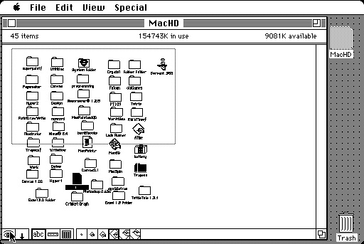 Servant uses a scrolling hand tool, like the one in MacPaint, as its default cursor, and you push things around in Servant windows. It even had inertial scrolling. It also has a navigation view, obtained by clicking on a little eyeball button at the bottom of the window (where a scroll bar would usually be).
Servant and MacPaint did not use scroll bars; they used a touch interface. Of course, you couldn’t touch them with your real fingers, but you used a virtual finger controlled by the mouse. Adobe Illustrator and Photoshop had scroll bars, but didn’t need them. They were just there because that’s what Macintosh users had come to expect.
When it came to scrolling, as in many other things, Atkinson and Hertzfeld were right. There were better solutions than scroll bars. But there was no single better solution. For single page graphics, a navigation view as in MacPaint works great. I never use scroll bars in Photoshop or Illustrator. I use the hand scrolling tool for short distances and the navigation view for large ones. For a multipage text document, some sort of go to page x tool is necessary. Scrolling tools that are highly customized for the nature of the document are better than generic ones. Servant worked fine for the small disks that were in use at that time, but it would not have been usable a few years later, when directories would contain hundreds or thousands of files. It had no list view. The navigation view wouldn’t have been satisfactory with a list view; you would have had to scroll through thousands of files serially. But a little thinking about the special nature of the data at hand can go a long way. The System 7 Finder introduced a simple thing that saved the Finder navigation problem. You could just take off typing the name of the file you were looking for. It would select the file you wanted as soon as you typed enough letters to remove all doubt about the one you wanted. And it would scroll the window to bring the file you selected into view.
Short and Long Range Scrolling
Scroll bars have two functions: one as an indicator and one as a control. If we get rid of scroll bars altogether and use a touch interface, as in MacPaint and Servant, we may be okay for short range scrolling. For small moves on the scale of the visible part of the document, we can see the elements of the document moving around, and live movement of those elements are the indicator we need to know what we have done. But how will we make larger movements to a distant part of the document? We certainly don’t want to have to do this by making lots and lots of small moves, touch or not. MacPaint and Servant offered a navigation screen as both an indicator of large scale scroll position, and as a course control for moving the field of view at that scale. Separating scrolling over short and long distances also made implementation sense. Back in the 1980s, when these programs were released, live scrolling of content was not commonly implemented, with or without scroll bars. If we dragged the thumb region of a scroll bar, we could see the control position changing live, but the document didn’t redraw in the new position until we stopped dragging and released the mouse button. Pushing the arrow buttons or clicking in the page up or page down regions produced an immediate change in the scroll bar’s thumb position, and then a redraw of the screen. Redrawing the screen might take a (relatively) long time, and it couldn’t be smoothly redrawn quickly enough for live scrolling. Of course, if the document had a backing store in memory (including the off-screen parts), scrolling could go fast. That’s how it’s done now. But that required more memory than you could rely on a Macintosh having in those days. Live scrolling became common in the 1990’s, when the memory to support it became universally available. But even then (and now), a memory image of the screen appearance of really large (e.g. multipage) documents can’t be maintained just for purposes of fast scrolling. Here again it is best to keep local and global scrolling separate. Keep a backing store of the local vicinity of the currently visible part of the document that you can use for short distance scrolls, a low res thumbnail of the whole thing for use in a long distance navigation view (e.g. page thumbnails) and then redraw the high resolution backing store from scratch when the user does a long distance shift of position in the document.
The Finder and its like (including iTunes)
When the Macintosh was introduced, computer programs were used to view, edit, or process individual documents. That is, except for one program. The Finder didn’t work with single documents, but instead organized and accessed a large set of documents. These days, many programs are more like the Finder than they are like MacPaint. They maintain a database of documents (mail messages, sound or movie files, photos, pdf files, etc), and allow the user to navigate around in them, sort them, or select ones to view or edit. You might think that such programs would show some family resemblance to the Finder. Sorry to tell you Finder, but I don’t think iTunes is your kid. Programs like iTunes are hierarchical browsers, children of the NeXT File Viewer. They break a single window into sections that contain navigation tools, usually as a list of names or icons. In Mail.app, we see a list of our accounts in one subview, and another subview contains a list of messages in the selected account. A third space is allocated for the document itself, the mail message. In iTunes most of the screen is occupied by navigation information of one sort or another. iTunes is special in that we don’t really need to see its documents at all. Users control how many songs they have in their inboxes or iTunes libraries, so there is no telling how many items the programs will have to maintain in these lists. When we want to read an email message or listen to a particular song we look for it in one of those lists... using the scroll bars. Except in iOS, and in OS X starting with 10.7, we don’t have scroll bars. We have a touch interface, and we scroll up and down in the style used in Servant. This kind of scrolling, whether done with an actual finger on the screen, a two-finger drag, or a scroll wheel on a mouse, is local only. If I am at the top of the list and I want to get to the end, I have to get the entire list to scroll by. I know it is extreme but I have about 5000 messages in the inbox on my Exchange mail account at work. I have my reasons. On my Mac Pro at work with a mouse and 10.6, I can list by date received, grab the scroll bar thumb, and immediately scroll down halfway to see the messages that arrived 6 months ago. On my iPad, I don’t even try to keep all the messages. I have it set to keep the 50 most recent messages. That’s pretty much the maximum number I can stand to scroll through using my fingertip. While I do it, (and only while I am scrolling) I can see the vestigial ghost scroll bar move, telling me how far I have come.
Why do we have those evanescent scroll bars? They are indicators telling us approximately where we are in the document, but they offer us no help in getting where we want to be. They are just a taunt, telling us we still got a lot of scrolling to do. I can’t tell you how many times I have tried to grab that skinny scroll bar with my finger tip and drag it to where I know it needs to go. I know it won’t help, but I can’t help trying, in my frustration trying to get way down a list of mail messages by finger-scrolling. By the way, it doesn’t help to get mad and push the scrolling list too hard. That just stops it from scrolling, and opens the mail message you just punched too hard. Maybe it won’t take too long to open. Better hope so, because everything is stopped while that happens.
This may not be too hard to fix. Consider Contacts. Contacts is another long scrolling list. I have a lot of contacts because (whether I want it or not) Exchange downloads the entire list of my University’s employees to my contacts list. It would be criminal to make me scroll down the list on my iPhone every time I wanted to call somebody whose name starts with W. On the iPad, this works great. There is a list of buttons, like the tabs on a Rolodex, with the letters of the alphabet. Actually, it looks more like a kind of spring-loaded mechanical address book my parents had. You would push one of a row of letter-labeled buttons on the thing, and it’s pressed steel lid would pop open to a page containing a bunch of addresses of people whose names corresponding to that button. Pressing the W button, I can go immediately to the Ws, where I can reasonably scroll to the person I want to contact. It would work on the iPhone too, if my fingertip was 2 mm in diameter. But as it is, every time I try to touch one of those buttons, the phone thinks that I have actually selected the adjacent contact whose active touch region is less than one fingertip-diameter away. Don’t get me started about my bookmarks.
Free at last
The absence of scroll bars is a step away from a generic solution to the scrolling problem. It means programmers are free to design their own solutions to the problem of navigating through data and documents. Because this is such a large component of program function, the solution that a programmer comes up with will have a big influence on usability. The mouse was an artificial pointer. Users didn’t intuitively know what to do with it. It was a good thing in those days to standardize how the mouse should be used, and a standard scroll bar was a part of that. It wasn’t perfect, but if you had used one before, you could it at least predict what it would do in a new situation. Now we are free of the mouse and we are on our own.
BG -- (basalgangster@macgui.com)
Saturday, July 30, 2011

