The Long View

The User Interface Guidelines
If you were a programmer trying to get started writing for the Macintosh in 1984, you would not have been surprised that you needed to read Inside Macintosh, Apple's documentation of the services provided by the new operating system. What probably would surprise you was finding that the first full chapter in Inside Macintosh was not an overview of the layout of a program in memory, or the mechanism used to call a system subroutine. That stuff was in the book, but you had to wait until you completed a chapter entitled "The Macintosh User Interface Guidelines".
If your previous programming experience was with a DEC PDP-11, Apple II or IBM PC or any of the host of small computer systems in use at the time, you had probably never received any previous advice on user interface design. The user interface of your program on those systems was entirely up to you, but anyway there weren't a lot of choices. Most programming was not what you could really call interactive. If you wrote for Unix or one if its derivatives, you probably were not making interactive programs, but rather command-line tools. Your user interface choices consisted of selecting an appropriate name for your program (preferably 2-4 characters) and a set of flags that modified it's effect. You probably chose a name with no vowels, and the flags were pretty much impossible to remember.
Interactive Software
If you were interested in making interactive software for pre-Macintosh computers, you probably were using your terminal's character-based display to write a screen-full of characters, including a menu of choices. Character-based displays like the terminals used on mainframe and mini computers, and the Monochrome Display Adapter that came with the IBM PC allowed a programmer to write a character any place on the 80x25 array of positions on the screen. This encouraged programmers to write interactive programs consisting of a tree of screens. A menu selection on one screen would move the user to a new screen, with a new set of menu options. Each screen was a mode, and the options available to the user depended on the position in the tree of screens, which was the result of the sequence of recent choices. If the choice you wanted was not on your current screen, you might need to go deeper, or you might have gone down a wrong branch of the tree and needed to back out. Backing out of the current mode or returning to the root of the tree of choices required a sequence of backward steps, often done by repeatedly punching the return or escape key. Programs with user interfaces like that still exist, and are used in point of sale systems at stores, in hotels, and airlines. 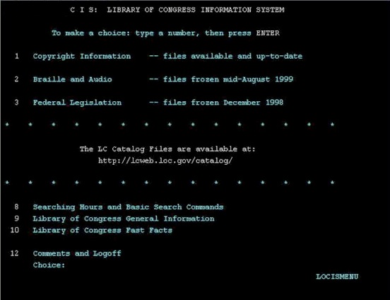 You can tell when your customer service agent is using one, because they quit looking or talking to you, and they start doing something very intense with their computer, consisting of repeatedly hitting the same key to move deeper and deeper into nested modes. Sometimes they pause to try to figure out where in the menu tree they are, and where they need to go. It looks so hard, takes a long time, and they always look very absorbed while doing it. The only way to be fast with those programs is to memorize the entire tree of screens and what can be done on each. These programs are holdovers from a previous era in computer programming, whose end was marked by the introduction of the Macintosh. Why do they still exist at point of sale terminals? a. No mouse. b. Bad software design. c. Both of the above.
Graphical User Interfaces Require Some Thought
The Macintosh opened up a lot of new possibilities. The high resolution screen, and the pointer and mouse meant that you could draw pretty much anything you wanted on the screen, and your program's interaction with the computer didn't have to be just a written dialog or navigating a tree of screens. You could use the computer as a simulator. If you were trying to keep a list of contacts, you could draw an address book on the screen, and let the user interact with it something like they way you world with a paper address book. This doesn’t mean that programmers had to duplicate the appearance of the real-world object being simulated. In fact, it is important to not make it look too much like the real thing. You don’t want to give users the impression that they can interact with it exactly like the object being simulated. Careful design of the program can make the simulation work with only minimal special effects.  A great example is the notepad desk accessory that came on the original Macintosh operating system. The notepad looked like a very simple blank pad of paper. There was a space to type into, a page number at the bottom of each page, and the bottom corner left corner of the front page was folded back. That was it. You could type a note on it. If you clicked on the folded back part of the page, an animation would show the page folding back, and the next page would be exposed. If you clicked on the page beneath (revealed by the folded back part of the current page), it would take you back a page. This was actually nothing like folding back the pages of a real notepad. You couldn’t turn the pages like a real note pad, but it was easy to figure out how to do it. If you were unsure about the meaning of the animation, the changes in page number informed you about what had happened. It worked because it was simple and direct, not because it was an accurate simulation of a paper notepad. It was better than a real notepad; it was a computer notepad. If you wanted to use a real notepad, you could easily do that, but you aren’t.
Figuring out how to make the particular operations of your program simple and direct was a challenge to programmers, especially ones who had never had to think much about user interfaces before. It was necessary to design some graphical elements that would guide the user. But it took some imagination. Every program needed something different.
The Guidelines
Recently there has been a lot of talk about Apple's aesthetic vision, and their emphasis on beauty in graphical design. Looking back at the User Interface Guidelines today, one expects to encounter a manifesto on aesthetic design. It isn't there. There is a little section dedicated to a description of the philosophy of user interface design. It outlines three principles that Apple suggests programmers follow in designing their applications. These were Responsiveness, Permissiveness, and Consistency. By responsiveness they really meant directness. They wanted the things that users needed to do to be reached with the fewest possible steps. Permissiveness meant that anything the user might want to do should be available at all (or nearly all) times. This was related to the issue of modal trees, as in the nested menu designs often used in programs at the time. Macintosh programmers were implored to use a single set of menus that would stay available all (or almost all) the time. Consistency meant that programs should all work about alike. Apple promoted this last principle by providing programmers with a large set of user interface software elements to use in their programs, including menus, controls and windows.
Instead of a treatise on the principles of user interface design, Apple stuck to practical and technical advice for programmers. Most of it was focused on consistent use of the user interface components provided in the Toolbox. Here’s the summary, from Inside Macintosh, Volume 1, page 70:
DO'S AND DON'TS OF A FRIENDLY USER INTERFACE
Do:
• Let the user have as much control as possible over the appearance of objects on the screen—their arrangement, size, and visibility.
• Use verbs for menu commands that perform actions.
• Make alert messages self-explanatory.
• Use controls and other graphics instead of just menu commands.
• Take the time to use good graphic design; it really helps.
Don't:
• Overuse modes, including modal dialog boxes.
• Require using the keyboard for an operation that would be easier with the mouse, or require using the mouse for an operation that would be easier with the keyboard.
• Change the way the screen looks unexpectedly, especially by scrolling automatically more than necessary.
• Redraw objects unnecessarily; it causes the screen to flicker annoyingly.
• Make up your own menus and then give them the same names as standard menus.
• Take an old-fashioned prompt-based application originally developed for another machine and pass it off as a Macintosh application.
Most of of what came to be considered essential for a Mac-like program was optional in the early days. For example, there was no requirement that programs draw their interface into windows. The early Macintosh had a 512x342 pixel screen, and you could use it all. Only one program could execute at a time, and your program owned the entire screen. There was no requirement to use scroll bars, controls, or even menus, and a lot of early programs didn’t use any of that stuff. That was alright with the User Interface Guidelines. They just wanted to make sure that users didn’t have to suffer through a sequence of nested menus or a sequence of questions posed in modal dialog boxes. But Apple was trying to make sure that their tools, the windows, menus and controls that they provided to programmers in the Toolbox, got used in a consistent way from one program to the next. Just about every program would use menus. Apple wanted you to do the things that were required to support the Apple Menu and Desk Accessories. You should have a File and Edit menu. The File menu should contain the New, Open, Save, and Quit menu items. Edit should contain Cut, Copy, Paste, Clear. You should do this even if your program doesn’t Cut or Copy anything, because they could be used by Desk Accessories. Radio buttons were supposed to be used to select a single choice from a set of mutually-exclusive items. Although they were single controls that didn’t come in sets or interact, programmers were supposed to use them in groups and make sure that when one was selected, the rest were deselected. If you wanted the user to select one or more of a set of mutually-compatible choices, you were supposed to use check boxes. Alerts came in three levels, according to whether they were just advisory, or were important confirmations, or serious states that required immediate attention. There were icons associated with each level that hopefully would become associated in users minds with the seriousness of the situation. These were strictly conventions. But they hoped that if everybody used them the same way, it would make it easier for users to generalized their knowledge from one program to another.
The Original Macintosh Environment, and Switcher
The Desktop metaphor was introduced in the Xerox 8010/Star, and then in the Lisa. In both of these systems, the desktop program was used for file management, and it was always available. Other programs opened documents on the desktop, and more than one kind of document could be open at a time, by different programs. Windows were required for use on the desktop, because documents were not intended to occupy the entire screen and obscure the entire desktop (which was needed to do file management at all times). On a real desktop, when you open a document, it does not cover your entire desktop. You can move it around on your desk to uncover other things you need. More than one document can be open at the same time. Your desktop never goes away.
Despite what the advertising said, the original Macintosh did not use the Desktop metaphor. It was a single job operating system. There was a sort of desktop in in the Finder, and you could use it for file management. But the Finder was just a program, like any other. When another program was running, the Finder and its desktop was gone, and the other program owned the entire screen. File management required while a program was running had do be done without the desktop, and on the Macintosh (unlike the Lisa or Star) you could create a new document, or save a copy of a document from inside programs using the Standard File Dialog. Because of this, Macintosh programmers were not required to draw their programs within windows. Lots of early Macintosh programs used the full screen, to avoid losing valuable screen real estate to the window boundaries, drag bar, and other window dressings. The use of standard controls was optional also. Because the standard controls were hard to make small, lots of programmers made their own controls, simpler and smaller than the Toolbox ones. None of this was a problem for the User Interface Guidelines, which were mostly about how to support the standard features that you did use. After all, the greatest Macintosh program of all, MacPaint, didn’t use moveable windows and occupied the full screen. Most programs did use the standard Menu bar, and did the things needed to support Desk Accessories. Desk Accessories were the de facto Macintosh’s substitute for the desktop and multitasking.
When multitasking officially came to the Macintosh, via Andy Hertzfeld’s Switcher program, it did not change the user interface for programs. Switcher gave every program the full screen, and let users shift from one to the others, almost exactly like the combination of full screen apps and Mission Control in the current version of Mac OS X. In the Switcher, you could switch to the Finder just like any other program.
Multifinder, and the Desktop Metaphor
The desktop metaphor arrived for Macintosh users in 1987, with Phil Goldman and Erich Ringwald’s Multifinder. This program, which was a Finder substitute, did not go away when you launched another program. Like the Lisa’s desktop, it was always there, under the windows of all the other running programs. Technically, it worked a lot like the Switcher, but it changed things for programmers. After the Multifinder, your program could not run full screen, but had to draw its documents in movable windows. The range of user interface styles open to Macintosh programmers was reduced substantially. Much more than any advice from Apple, the Multifinder persuaded programmers to make their programs use a consistent user interface, and made all Macintosh programs look and work alike. Until system 7 was introduced, the use of the Multifinder remained optional, and users could turn it off and go back to the Finder to use programs that didn’t follow the rules.
The Macintosh II, and Color
Also in 1987, and 4 years before System 7 was introduced, the Macintosh II line of computers was released. You could use a color monitor on the Macintosh II. The operating system had always included a (somewhat limited) method for drawing in color, even though previous Macintoshes had always had monochrome screens. The color support in the original Macintosh OS was used for printing on color printers like the Imagewriter II. With the introduction of the Macintosh II, the existing color support in the operating system made it possible to add color to programs immediately, without any change in the operating system. Color support was soon enhanced with the release of Color Quickdraw as a system extension for System 6. With Color Quickdraw, programmers had full use of color in their programs. Apple released a new volume of Inside Macintosh (volume V) to describe the new capabilities of the Macintosh II computer line. Included was a new chapter of the User Interface Guidelines governing, among other things, the use of color.
It should be mentioned that color had been available on character displays for the IBM PC since introduction of the Color Graphics Adapter 1981. Programmers of those systems had abused color egregiously, and users of the IBM PC were assailed by the most tasteless gratuitous acts of meaningless color violence for years. Much of it made no sense at all. Different parts of the screen were drawn in clashing combinations of the 16 unsubtle colors provided by the CGA, for no reason whatsoever. Even the justified use of color in the IBM PC was an offense to the senses. For example, it was impossible to draw text in bold face or italic, or even underlined, on those character screens. Word processors that wanted to support such things when printing often used colors to indicate passages that would be printed bold, italic, or underlined. It was even possible to specify that text should blink on and off like Christmas tree lights. And yes, that was done. There was little choice when it came to specifying type face changes, but looking at a screen like that was an assault on the eyes, and of course was no natural relationship between color and typeface. It was strictly arbitrary, and no two word processors used the same convention. This kind of thing gave the IBM PC a reputation for poor aesthetics, and IBM PC programmers the reputation for lacking taste, or even good sense, when it came to the use of color in their programs.
It is in that context that we should understand the advice of Inside Macintosh Volume V, suggesting restraint in the use of color. Here are some excerpts:
General Principles of Color Design
Two principles should guide the design of your application: begin the design in black and white, and limit the use of color, especially in the application’s use of the standard interface.
Colored Text
Reading and legibility studies in the print (paper) world show that colored text is harder to read than black text on a white background.
Specific Recommendations
Remember that color should never be the only thing that distinguishes objects. Other cues such as shape, location, pattern, or sound should always be used in addition to color...
Color the Black Bits Only
Generally, all interface elements should maintain a white background, using color to replace black pixels as appropriate. Maintaining the white background and only coloring what is already black (if something needs to be colored at all) helps to maintain the clarity and the “look and feel” of the Macintosh interface.
Menus
In general, the only use of color in menus should be in menus used to choose color...
Dialogs and Alerts
Except for dialog boxes used to select colors, there’s no reason to color dialog boxes...
Pointers
Most of the time, when the pointer is being used for selecting and pointing, it should remain black – color might not be visible over potentially different colored backgrounds and wouldn’t give the user any extra information.
These comments on color are the first instances I can find of purely aesthetic advice in the Macintosh User Interface Guidelines, and even these are presented and justified mostly as technical considerations, not as promoting any particular approach to good taste. It should be noted that there was very little color used in the Finder or in the standard window, control or menu definition functions at this time. For the Macintosh II, Apple introduced the 6-colored apple in the menu bar, and the Finder acquired a Color menu, that could be used to assign a color to a folder or icon. But for the most part, Apple followed their own advice regarding the use of color. Even the use of shades of gray in the standard Macintosh user interface was postponed until System 7. It is sometimes forgotten that more than 4 years passed between the introduction of color in the Macintosh computer in March 1987, and the introduction of System 7 in May 1991. During that time, the use of color was strictly the domain of the application programmer, and the example from Apple was one of restraint.
The other major user interface features introduced in 1987 were the hierarchical menu and the popup menu. Popup menus were heavily used in Smalltalk-80, and their omission in the original Macintosh Toolbox must have been by design. Programmers had created popup menus on their own, and every implementation was a little different. The new User Interface Guidelines emphasized standardization of their appearance and use.
System 7
System 7 made many and deep changes in the Macintosh Operating System, but was sold to users mainly on the basis of its more beautiful interface. In the time since the Macintosh was originally released, the NeXT computer had been introduced. It surpassed the Macintosh in a number of ways, not the least of which was its spectacular use of shades of gray in windows, icons, and controls. Apple wanted to provide something that looked as good as NeXT.
It should be recognized that Apple, while promoting its standard look and feel in the User Interface Guidelines, had also provided programmers with the means to deviate from it. From the beginning, Apple had provided programmers with the source code to the window and control definition functions, and with the means to write and install their own. If you wanted to make a window that looked exactly like one from NeXT, you could do that, and code to do these things were written and shared among programmers. In retrospect it is surprising that most programmers used the standard user interface items without modification. They did it, not out of laziness, but on purpose, to enhance the consistency of their programs with those of others. For commercial programs, a large premium was put on programs looking and behaving in a “Mac-like” fashion.
Programmers and users alike were generally pleased with the attractive but still recognizable and restrained appearance of System 7. The new system gave rise to a giant new tome of Inside Macintosh, and its Chapter 2 is a 35 page addendum to the User Interface Guidelines. Perhaps emboldened by the positive response to the mildly philosophical passages in the previous versions of Inside Macintosh, this chapter was more discursive about the philosophy of user interface. It it is here that they first suggest that programs use metaphors from the “real world” (I suppose “real world” means objects that are not found on your computer). The principle they had previously called consistency, they now called “aesthetic integrity”.
Most importantly, System 7 made the desktop metaphor compulsory, and programs were required to draw into windows, and respect the ownership of the screen by another program, the Finder. The fact that all program’s windows were on the screen at the same time also had implications for the use of color. Most early color video boards used 8-bit pixels that could represent 256 colors and/or shades of gray. Many graphically-intense programs needed to remap most or all of the color palette, and when a program like that came to the front it remapped the entire screen. For example, a program for editing gray scale photographs would need to map the entire color maps to represent shades of gray. This would caused all other programs‘ windows to suddenly change their color palettes. This could produce some very strange and unpleasant effects. If the operating system had continued in the Switcher style, running each program in its own screen, this would have been avoided. But in the Multifinder, it was important for programs to be good residents on the desktop, both by restricting their drawing to windows provided by the operating system, and by restraint in the remapping of the color palette. Technical issues trumped aesthetic ones, and even Inside Macintosh VI, with its increasing philosophical tone, was mostly about the technical, rather than the aesthetic side of user interface programming.
In 1993 (still in the System 7 era), Apple published an entire book on User Interface, entitled “Macintosh Human Interface Guidelines. This book covered the same ground, but included much more advice, and was beautifully illustrated. It also included a CDROM called “Making it Macintosh” with great images, but little more in the way of information. The idea of the metaphor was emphasized in this period. In the 1992 Human Interface Guidelines chapter from the new Inside Macintosh, they say:
You can take advantage of people’s knowledge of the world around them by using metaphors to convey concepts and features of your application. Use metaphors involving concrete, familiar ideas and make the metaphors plain, so that users have a set of expectations to apply to computer environments. For example, people often use file folders to store paper documents in their offices. Therefore, it makes sense to people to store computer documents in computer-generated folders that look like file folders. People can organize their hard disks in a way that’s analogous to the way they organize their file cabinets.
OS X
The current version of the Human Interface Guidelines for Mac OS X is dated 2011, and it is 276 pages long! Why have the Interface Guidelines grown so long? Maybe part of it is just the freedom of electronic publishing. There is no page budget, so there is no premium on brevity. A lot of what is in the current version is familiar material on the use of menus and controls. Some of it has been in the Guidelines since the beginning, but in this version it is written in extended style. Many illustrations show you what you should and should not do in your program. The level of detail that in the instructions is amazing, and it often crosses the border into micromanagement. For example, many Macintosh programs used to have a Search or Find menu. These allowed quick access to search features in programs that feature search heavily. Apple now insists that search features should be installed in the Edit menu, way down below cut, paste, clear, undo, select all, deselect all, etc. Of course you don’t have to do what they say, but many programs blindly follow this half-baked advice (Mathematica, for example) to the user’s detriment. By the way, thank you to BBEdit, for maintaining your Search menu. In general, the principles of user interface design offered in the guidelines today remain the same as always, but are rewritten in a more authoritarian dogmatic style. The idea of the metaphor has become engraved in stone, and all programs are supposed to have one. On page 27 it repeats the 1992 statement about files and documents and offices. But now we are explicitly told to make things beautiful, as well as functional. The large section called “Captivate with Gorgeous Graphics” includes this statement:
When appropriate, consider adding the appearance of real-world materials. In some cases, real-world textures, such as wood, leather, metal, or paper, can enhance the experience of an app and convey meaning to users.
A subsequent section, entitled “Consider Adding Physicality and Realism” implores programmers to abandon the simple functional designs of the past, and to imbue their programs with the most “realistic” imagery and movement possible. This is an elaboration of the metaphor idea. I guess it comes up because the computer is now capable of much more realistic images and animation than ever before. But just when you think Apple has gone off the deep end with this suggestion to add realistic images that evoke some non-computer activity, it is tempered by some sound advice about the limits of metaphor.
Don’t sacrifice clarity for artistic expression. For example, it might make sense to show notes or photos pinned to a cork board, but it might be confusing to use a cork board background in an app that helps people create a floor plan for their home. If users need to stop and think about what your images are trying to communicate, you’ve decreased the usability of your app. (p. 47)
Clearly, the User Interface Guidelines are not of a single mind about this metaphor thing. Should we use the cork board? Or should we assume that users know that the cork, while necessary for a real cork board, has no function on the computer screen, and would only be a distraction. Should we try to make clean, functional programs like the original Note Pad Desk Accessory? Or should we dress up our programs with a bunch of functionless imagery intended mainly as eye candy?
The End of Metaphors
The desktop metaphor was valuable in the beginning, because nobody was sure how to interact with a computer. A reference to some pre-computer object might be helpful to make a program that people could use without reading a manual or taking a course. But that was 1984, and things have changed. I don’t need my computer to work like a desktop anymore, and I bet you don’t either. You know why? Because I don’t even have a real desktop any more. My office is in my computer. I might put it on a desk, but the desk is not my workspace. I don’t have file cabinets with folders in them. I don’t take documents out of folders and open them on my desktop. I don’t use a paper notebook, or date calendar, or address book, and I haven’t used any of these for 20 years. There isn’t much point in trying to help me understand how a computer program works by making it look like some real-world object that I never use. And it especially doesn’t help to make programs that look like some totally obsolete object from the long lost past, that I have never used.
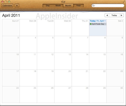
For example, I have never used a date calendar bound in faux (or real) stitched leather, with tear-off pages that have not torn off smoothly. Years ago, when I used a paper date calendar, I would never have purchased a calendar with tear-off pages and fancy leather binding. Those things don’t go together. Tear off pages means that the calendar is going to be thrown away at the end of the year, and leather was valuable and beautiful, and used on objects that could be expected to last longer than that. Leather date calendars used slip-in pages that didn’t need to be torn off, and could be reloaded at the end of the year. Leather didn’t really look like that, either. It looked a lot better, but I didn’t care about it then and I don’t care about it now. You see, leather does not have any functional relationship to an appointment calendar, and having it there does not help me understand how to use the calendar program. If I had no experience with computers at all, it wouldn’t help me get started. I use my computer calendar all day, and the simulated leather doesn’t help one bit.

From a programming and user interface point of view, putting simulated leather at the top of the window containing my calendar tells me nothing about what it is used for or how to use it effectively. And what about that address book, with its red ribbon bookmark? It looks like something that might have been used by Ralph Waldo Emerson. Is there anyone still alive who has ever used a bookmark like that? The layout is wasteful of screen real estate, and saddles us with drawbacks of the real object. I don’t want to use a paper calendar or address book. I like the ones on my computer better, because they are more compact and can do things that real ones can’t (like cross-referencing and grouping of contacts). Don’t remind me of the days when I had to use those “real world” things.
These OX 10.7 versions of the familiar iCal and Contacts programs look a little more like real life objects than their predecessors, but they don’t look like real life objects we would like to own, or would buy now. They are not good design functionally, and their gratuitous decorations are not helpful at directing users to use them well. They are the modern equivalent of the crazy use of color in the IBM PC programs of the 1980s.
Anyway, there aren’t any computer newcomers any more. The way we learn programs today is not by analogy to real world objects we have been using until recently. It is by analogy to other computer programs we have used in the recent past. We have learned how computer address books and calendars work. When picking up a new one, we expect to start where our knowledge of the old one left off. For this reason, consistency in user interface design is as important as ever. Apple designers, think about this:
Most people make the mistake of thinking design is what it looks like. People think it’s this veneer – that the designers are handed this box and told, ‘Make it look good!’ That’s not what we think design is. It’s not just what it looks like and feels like. Design is how it works.” – Steve Jobs
BG -- basalgangster@macgui.com
Sunday, December 4, 2011